Socar Brand
Responsibilities
Creative Direction, Design Lead, Rebranding, Sub-/Co-branding, Brand Architecture, Client Management, Gas Station Design, Wayfinder, Uniforms, Print Design, Fleet Design.
SOCAR, the State Oil Company of the Azerbaijan Republic, is Azerbaijan’s national oil company, headquartered in Baku. It is responsible for producing oil and natural gas from both onshore and offshore fields in Azerbaijan. I Led the creative team to develop SOCAR’s brand for the Swiss market, which evolved into its international brand identity.
My Role
As Lead Senior Brand Designer for this re-branding project I managed teams of designers for this large scale branding project. I maintained high level brand concepts and developed design details that crafted this one of a kind brand identity.
I also worked closely with strategic partners such as architects OOS, technical fabrication experts Westiform, and animation studio Aldinger Wolf, to bring the unique brand design into reality.
All Rights Reserved SOCAR
Agency | JVM/Brand Identity
Published | 2011
Design Team | Roland Dill, Margaret Steffen, Martin Bollman, Dieter Glauser, Lukas Mettler
Strategy | Sophie Hutter, Tobias Baumann


Branding for Switzerland
Socar Branding
Project Name Socar
Client 2012
Date Brand Design, Creative Direction
ResponsibilitiesWhen this project entered the studio, we faced a few key challenges. As the agency’s only brand designer, it was essential to quickly expand the creative team. More importantly, the project brief strictly prohibited any modifications to the existing logo, despite its evident legibility issues.
Problem
How might we create an iconic and successful brand identity for the Swiss market working with a flawed logo design that is difficult to read?
Solution
We chose to go beyond the constraints of the briefing and pursue the approach we knew was right. This bold decision, made by our managing director, Dr. Thomas Deigendesch, was instrumental to the project's success.
Early Exploration
Based on the extensive research work done by the strategic team. I motivated a small group of designers to explore visual identity directions by building out mood boards and shaping concepts for the rebranding.
Before we settled on the flame icon, there were many other design directions related to energy, power, and motion. Below is a snapshot of an early concept called “Pit Stop” that had the first image of the flame that later became a central idea.
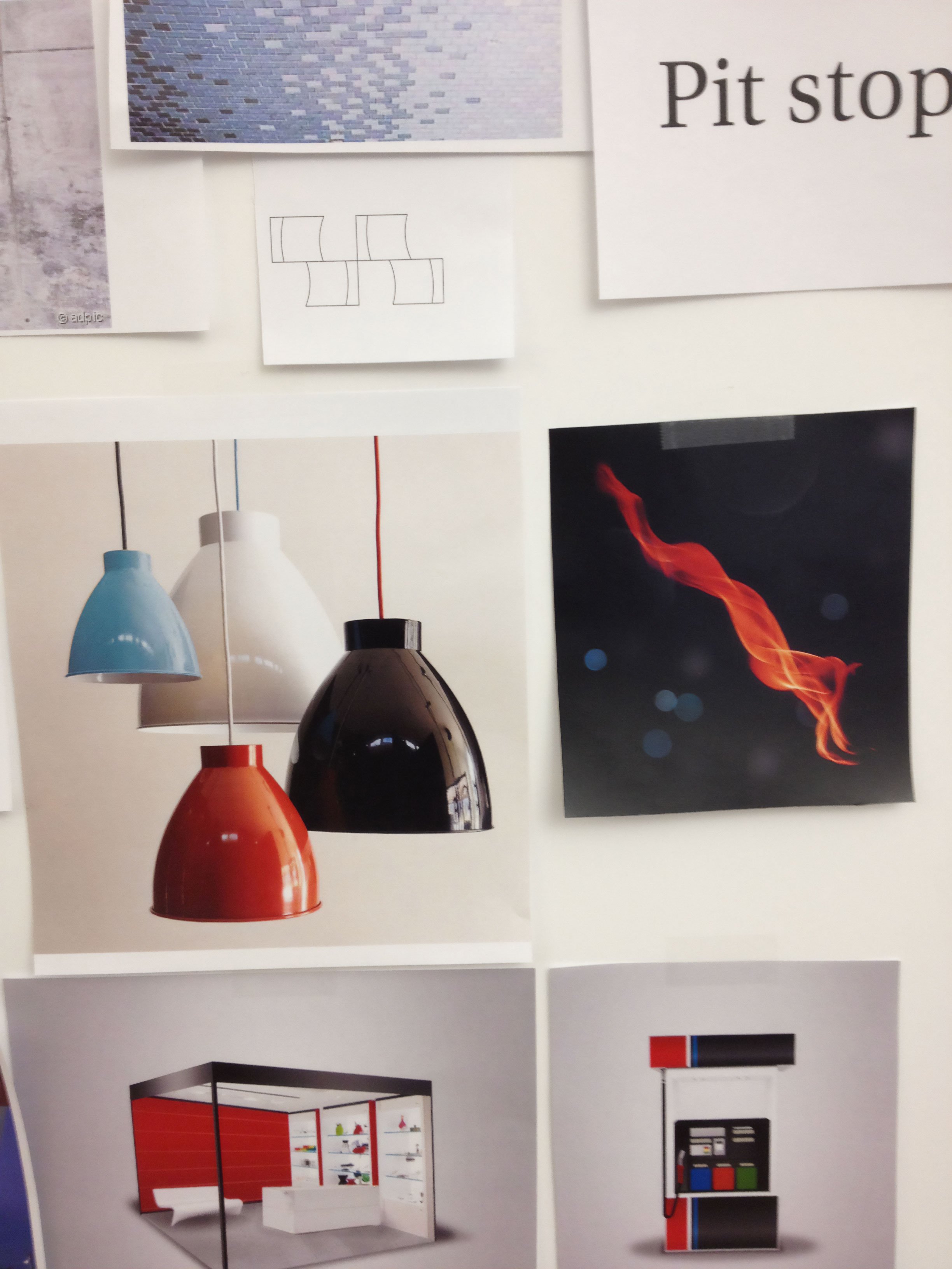

Design Concepts
Examples of different design concepts and variations that did not make it to the final design. The design directions were either left behind or adjusted for practical reasons.


Visual evolution
A visual journey leading through the creative process for the rebranding of Socar Energy Switzerland. All rights reserved to Jung von Matt/brand identity.
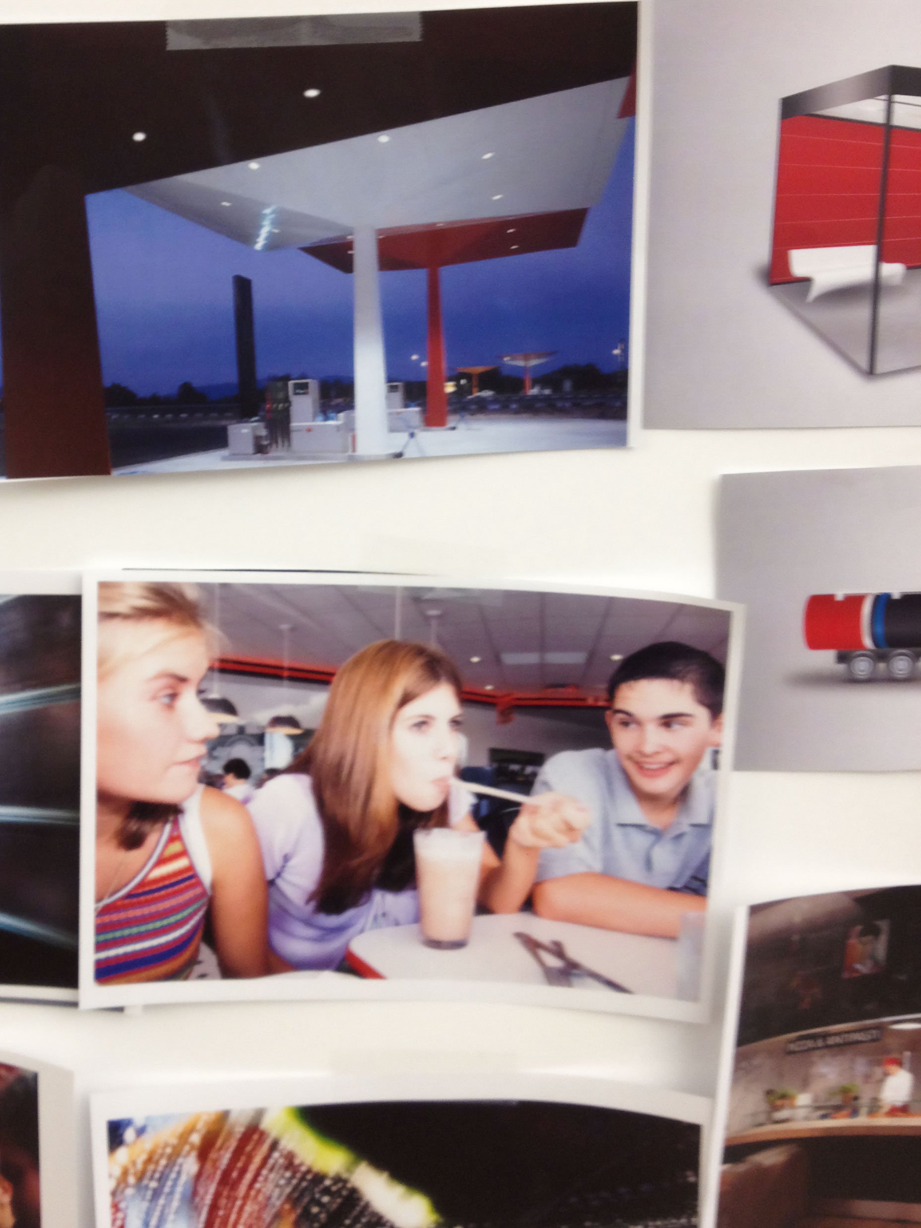
Gas Station Concepts
These gas station design concepts and variations were explored but didn’t make the final cut. Some were set aside, while others were refined or adjusted for practical reasons.


Station evolution
Witness the birth of Zürich’s first Socar station unfold in this timelapse, where a long period of work progresses in moments.
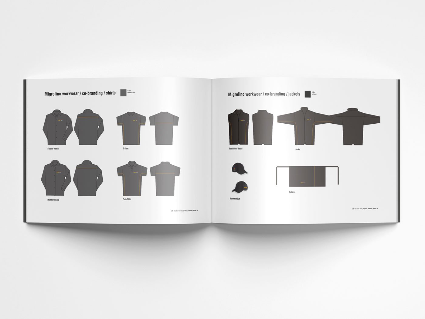
Brand Design
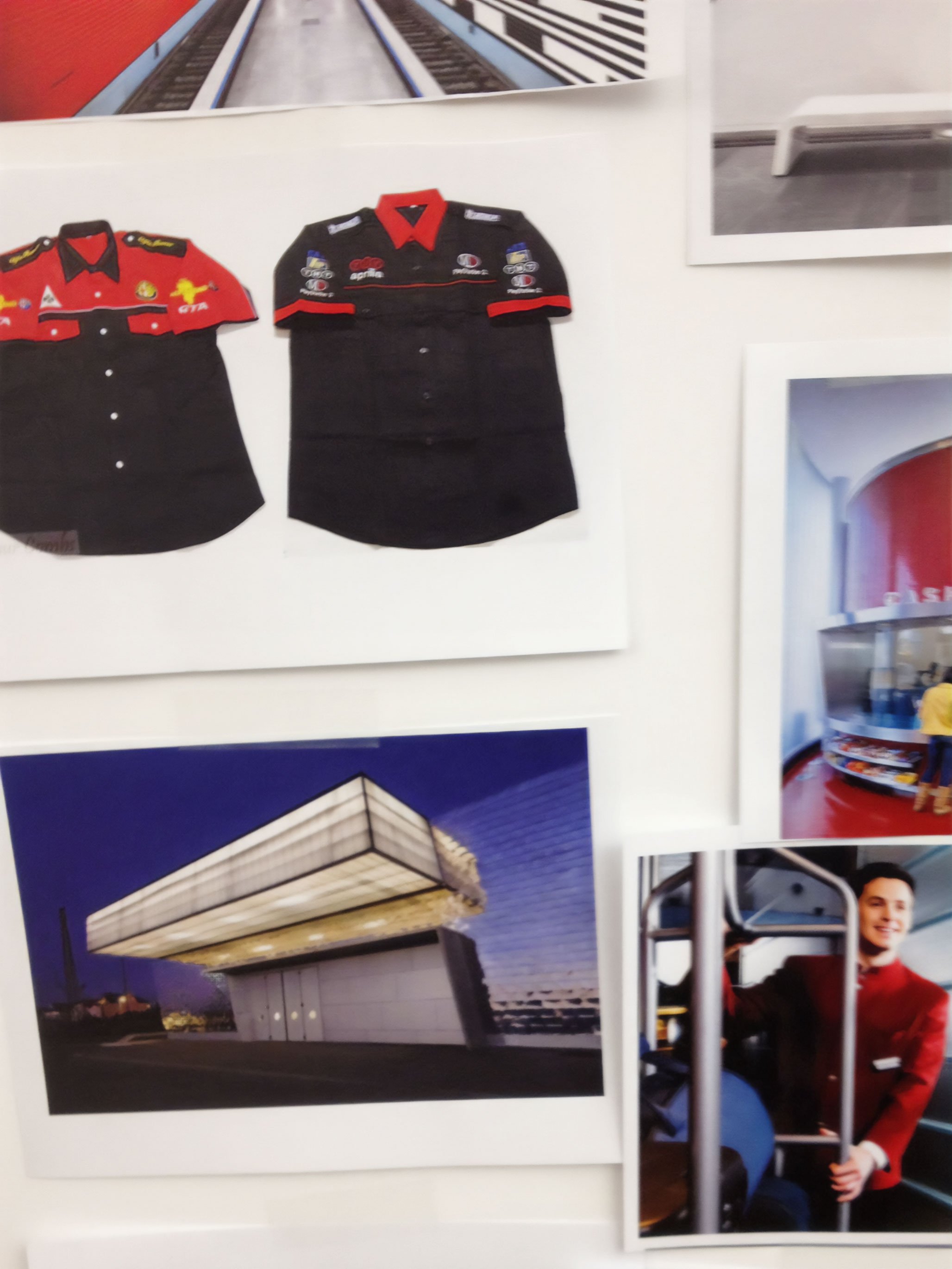
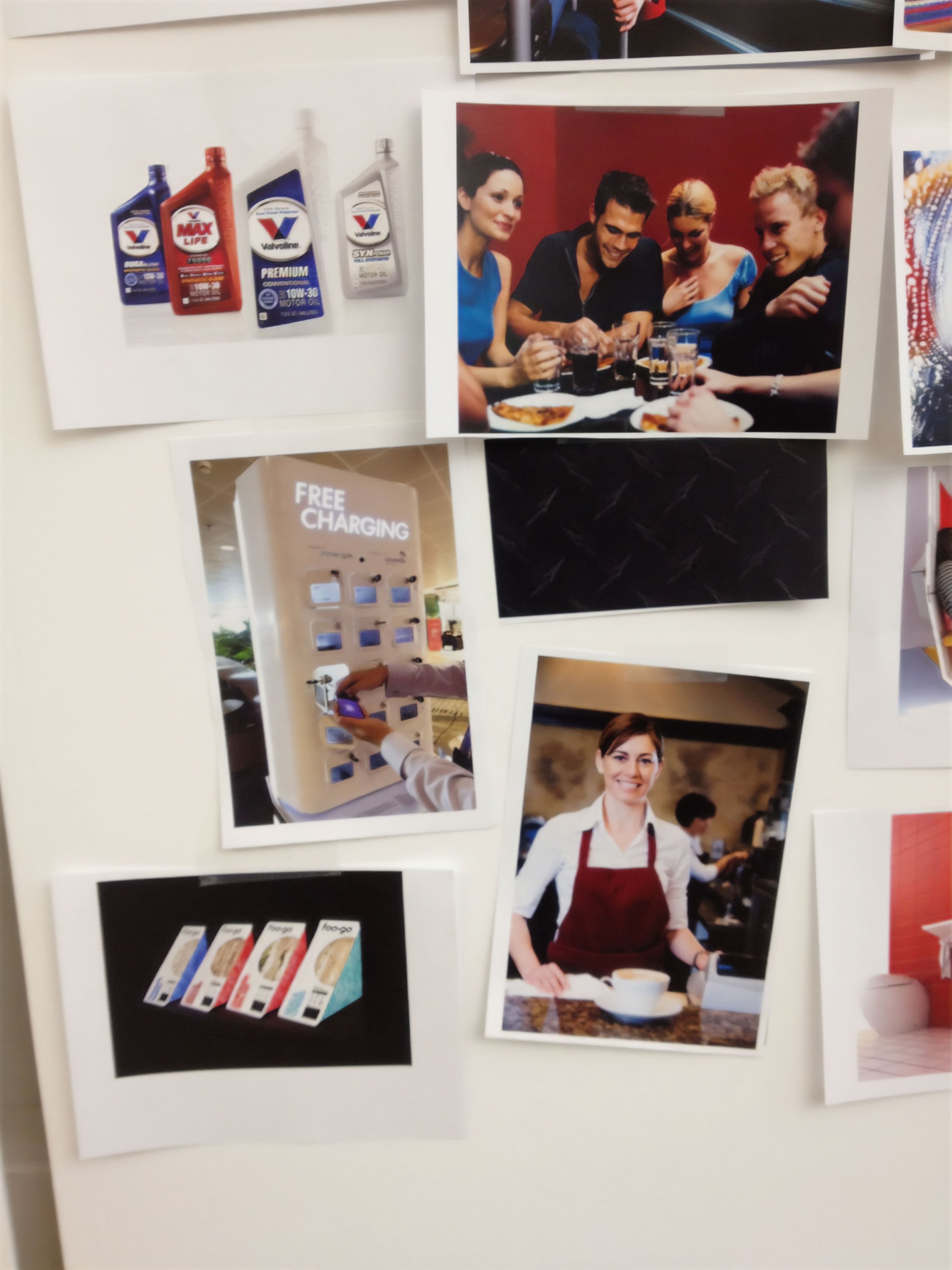
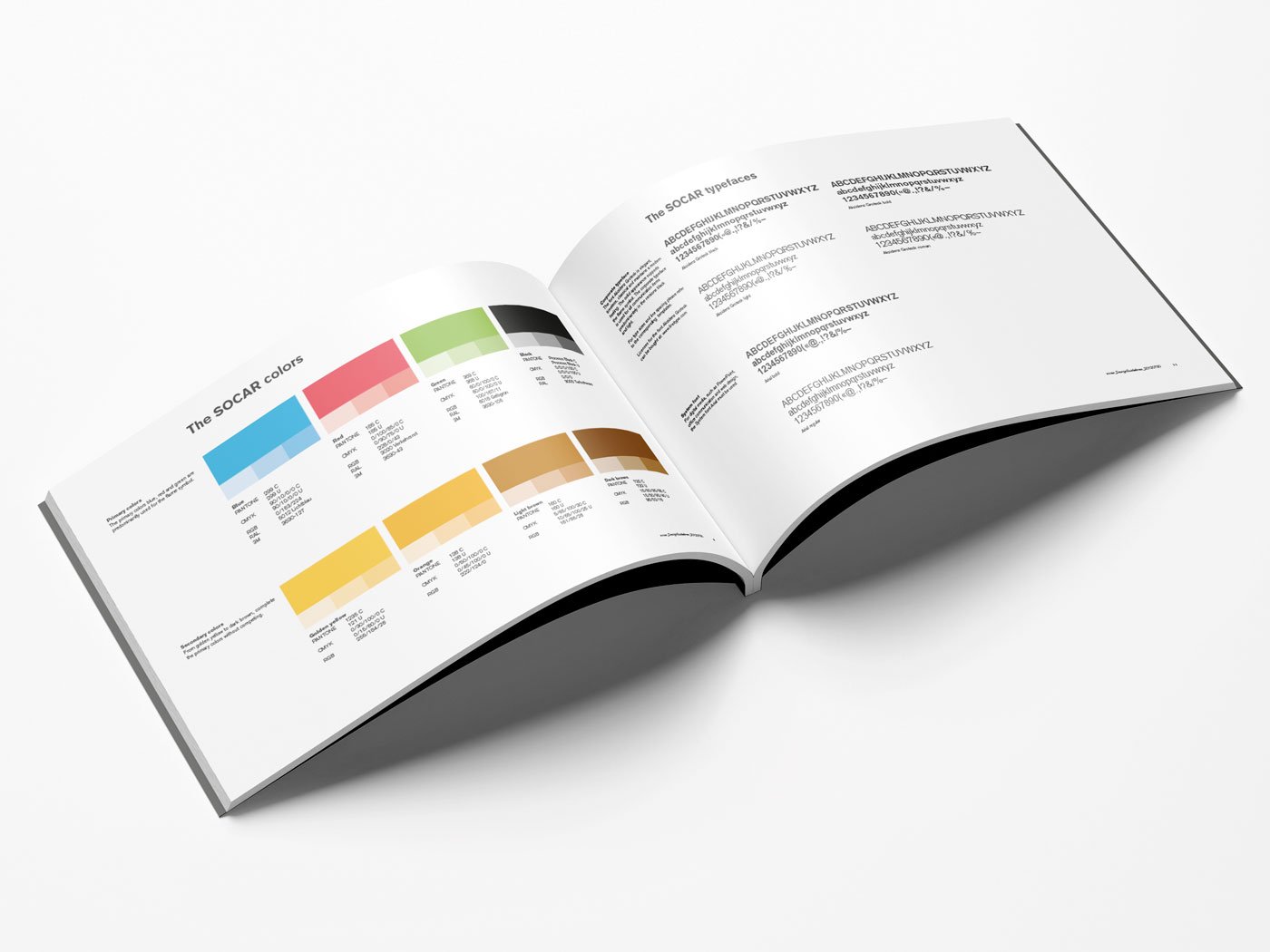
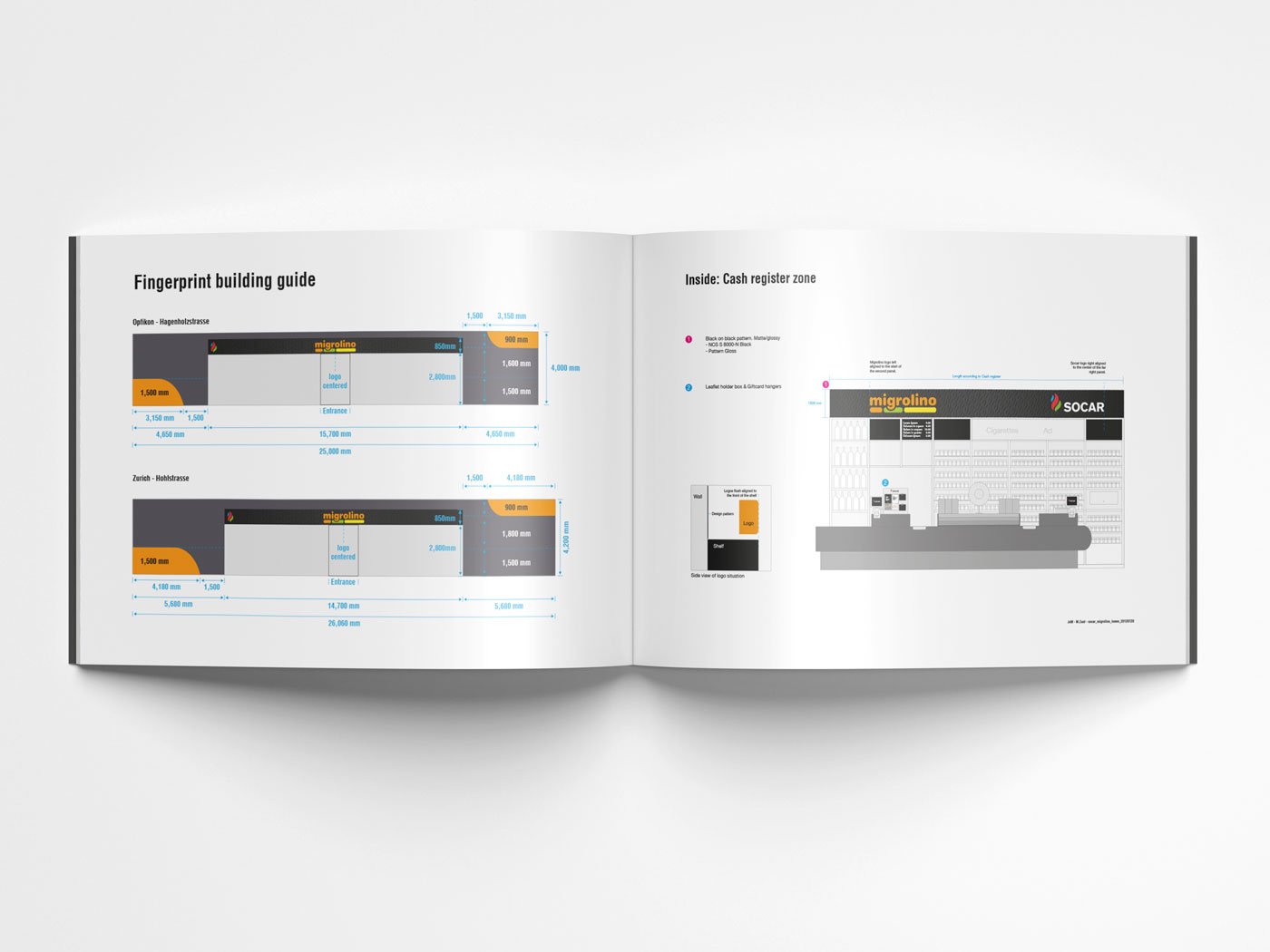
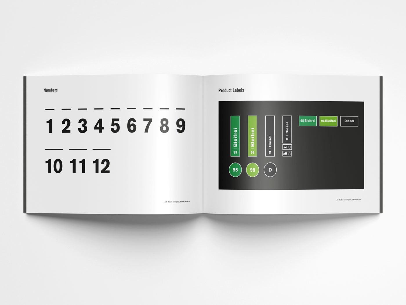
This project encompassed extensive touchpoints, including interior and exterior of buildings, gas station pumps, uniforms, signage, multiple logos, sub-brands, and co-branding. The foundation was built on the logo mark, color palette, typography, and image world.


Socar Branding Takeaways

1. Backbone
Success in creative work begins with confidence in your abilities, convictions, and decisions. Clients don’t always know what they truly need. It’s your job to help them see the bigger picture which requires strength of character.
2. Teamwork
This experience taught me to trust teammates, know when to compromise, and when to stand by your creative vision. The importance of joint effort between design and strategy.
Photo of Me (Design) and Tobias Baumann (Strategy) at the brand launch.
3. Honesty
For years, I followed Dieter Rams' 10 Principles, Principle 6: "Good design is honest." A black gas station with a flame logo felt like an honest take on fuel. I now focus more on Principle 9: “Good design is environmentally-friendly.” in an attempt to design a better future.